
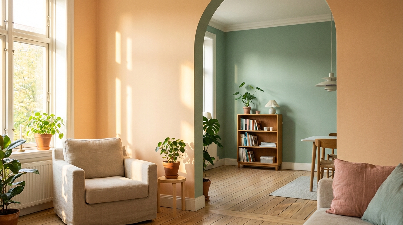
Wall color has a powerful effect on how a room feels, even before furniture or decor are noticed. Color can make a space feel calm, energetic, cozy, or open without changing the room’s size or layout. Because walls cover large surfaces, their color sets the emotional tone and influences how people experience the space over time. Understanding how wall colors work helps homeowners, renters, and designers make choices that support comfort, focus, and mood indoors.
Indoor color choices are not only about style or trends. They connect to how the human brain reacts to light, contrast, and visual balance. A well-chosen wall color can support daily routines, encourage relaxation, or help people feel more alert. When color decisions are made with intention, rooms often feel more functional and pleasant without extra decoration.
The Basics of Color and Mood
Color affects mood because the human brain connects certain hues with emotional responses. These reactions come from a mix of biology, personal experience, and learned associations. For example, some colors are linked to nature and safety, while others suggest movement or alertness. When applied to walls, these reactions become part of daily indoor life.
Wall colors influence mood in a steady, background way rather than in short bursts. Unlike art or accessories, walls stay in the visual field for long periods. This means their emotional effect is more subtle but also more lasting. Choosing the right wall color helps support how a room is used throughout the day.
Hue, Value, and Saturation
Three main qualities define any wall color: hue, value, and saturation. Hue refers to the color family, such as red, blue, or green. Value describes how light or dark the color appears, while saturation shows how strong or muted the color is. Together, these qualities shape how a room feels.
A bright, highly saturated color often feels lively and bold, while a muted version of the same hue feels softer and calmer. Light values can make spaces feel open, while darker values add depth and intimacy. Understanding these elements helps explain why two colors in the same family can create very different moods.
Warm Colors and Their Emotional Impact
Warm colors include reds, oranges, and yellows, along with many shades that lean toward these hues. These colors are often associated with warmth, energy, and comfort. When used on walls, they tend to make rooms feel more active and inviting. Warm colors can also make large spaces feel more intimate.
Because warm colors visually advance toward the viewer, they can make walls feel closer. This effect is helpful in rooms that feel too large or empty. However, in small spaces, strong warm colors can feel intense if not balanced carefully.
Red and Its Variations
Red is one of the strongest wall colors in terms of emotional impact. It is linked to energy, passion, and alertness. In indoor spaces, red can increase a sense of warmth and activity. This makes it a bold choice that works best in moderation.
Darker or muted reds, such as brick or burgundy, feel more grounded and cozy than bright red. These shades often work well in dining rooms or social spaces where conversation and connection are important. Lighter reds and pinks tend to feel softer and more playful.
Orange and Yellow Tones
Orange combines the energy of red with the cheerfulness of yellow. On walls, orange tones often feel friendly and stimulating without being as intense as red. Soft terracotta or peach shades are especially popular for creating warmth without overwhelming the room.
Yellow is commonly linked to sunlight and optimism. Light yellow walls can make a room feel bright and welcoming, especially in spaces with limited natural light. Strong yellow shades should be used carefully, as they can feel overly stimulating if too intense or too bright.
Cool Colors and Their Emotional Impact
Cool colors include blues, greens, and purples. These hues are often associated with calm, rest, and balance. When used on walls, cool colors tend to make rooms feel more spacious and relaxed. They are commonly chosen for bedrooms, bathrooms, and quiet work areas.
Because cool colors visually recede, they can make walls feel farther away. This effect helps small rooms feel larger and more open. Cool colors also tend to feel less demanding, which supports focus and relaxation.
Blue and Its Effects Indoors
Blue is widely associated with calmness and stability. Many people find blue walls soothing, especially in areas meant for rest or concentration. Lighter blues can feel airy and fresh, while darker blues add depth and seriousness.
Very dark blue walls can feel dramatic and cozy when balanced with good lighting. However, overly dark shades may feel heavy in rooms without enough light. Choosing the right value of blue helps match the desired mood of the space.
Green and Natural Balance
Green sits between warm and cool colors, which gives it a balanced feel. It is strongly linked to nature, growth, and renewal. Green walls often create a sense of calm without feeling cold or distant.
Soft greens work well in many rooms because they are easy on the eyes. Darker greens can feel rich and grounding, especially when paired with natural materials. Green is often chosen for spaces where people spend long periods of time.
Neutral Colors and Emotional Flexibility
Neutral colors include whites, grays, beiges, and taupes. These colors do not strongly push mood in one direction, which makes them flexible and widely used. Neutral walls often act as a backdrop that allows furniture and decor to stand out.
Even though neutrals are subtle, they still influence how a room feels. Warm-toned neutrals feel cozy and inviting, while cool-toned neutrals feel clean and modern. The undertone of a neutral color plays a major role in its emotional effect.
White Walls and Perceived Space
White walls are often associated with cleanliness and simplicity. They reflect light well, which makes rooms feel brighter and larger. White also provides a sense of openness that many people find calming.
Different whites can feel very different depending on undertones. A warm white feels softer and more welcoming, while a cool white feels crisp and modern. Choosing the right white helps avoid a space feeling too stark or too dull.
Gray, Beige, and Modern Neutrals
Gray has become popular for its ability to feel modern and balanced. Light gray walls often feel calm and polished, while darker grays add depth and drama. The key is selecting a gray with the right undertone for the room’s lighting.
Beige and taupe offer warmth without strong color. These shades often feel comfortable and timeless. They are especially useful in shared spaces where a neutral mood is preferred.
Light, Dark, and Perception of Space
The lightness or darkness of a wall color has a strong effect on how big or small a room feels. Light colors reflect more light, which makes spaces feel open and airy. Dark colors absorb light, creating a sense of enclosure and intimacy.
Choosing between light and dark walls depends on the room’s size, purpose, and lighting. A dark wall can feel comforting in a bedroom but heavy in a narrow hallway. Understanding this balance helps avoid unwanted effects.
Using Dark Colors Intentionally
Dark wall colors can create a sense of depth and sophistication. They often make a room feel cozy and protected. When paired with good lighting and lighter accents, dark walls feel rich rather than gloomy.
Dark colors work well on accent walls or in rooms meant for relaxation. They can also highlight architectural details. Careful planning helps prevent dark walls from overwhelming the space.
Saturation and Emotional Intensity
Saturation refers to how strong or muted a color appears. Highly saturated colors feel bold and energetic, while low-saturation colors feel soft and calm. Wall color saturation plays a big role in emotional comfort.
Muted colors are often easier to live with long term. They create a gentle background that does not demand attention. Bright colors can be exciting but may feel tiring if used too much.
Choosing Muted Versus Bold Walls
Muted wall colors are popular in living rooms and bedrooms because they support relaxation. These colors still add personality without overwhelming the senses. They also adapt well to changes in decor.
Bold colors are often used to express creativity or energy. They can work well in playrooms or creative spaces. Limiting bold colors to specific areas helps keep balance in the home.
Room Function and Color Choice
Each room in a home serves a different purpose, and wall color should support that function. A relaxing color in a bedroom may not work well in a busy kitchen. Matching color mood to room use improves comfort and usability.
Considering daily activities helps guide color decisions. Spaces for rest benefit from calm colors, while active spaces can handle more energy. This approach makes color choices more practical and effective.
Bedrooms and Restful Tones
Bedrooms benefit from wall colors that promote calm and rest. Soft blues, greens, and neutrals are common choices. These colors help reduce visual stress at the end of the day.
Darker shades can also work in bedrooms if the goal is a cozy atmosphere. Balanced lighting is important to keep the room from feeling too dark. The overall effect should support sleep and relaxation.
Kitchens, Living Rooms, and Activity
Kitchens and living rooms are often social and active spaces. Warm colors or balanced neutrals help create an inviting feel. These colors support conversation and movement.
Bright colors can be used carefully to add energy. Too much intensity may feel chaotic over time. A balanced palette keeps the space comfortable for daily use.
The Role of Lighting in Wall Color
Lighting changes how wall colors appear and feel. Natural light shifts throughout the day, altering color perception. Artificial lighting also affects warmth and brightness.
A color that looks calm in one room may feel different in another because of lighting. Testing wall colors under different lighting conditions helps avoid surprises. This step is important for emotional comfort.
Natural Light Versus Artificial Light
Natural light tends to show colors more accurately, but its direction and intensity matter. North-facing rooms often make colors appear cooler. South-facing rooms bring out warmth.
Artificial light can add yellow or blue tones depending on the bulb type. Warm lighting softens colors, while cool lighting sharpens them. Matching wall color to lighting creates a more consistent mood.
Cultural and Personal Associations
Color meanings are not universal. Cultural background and personal experience shape how colors are perceived. A color that feels calming to one person may feel uncomfortable to another.
Personal memories connected to color can influence emotional response. This makes individual preference important when choosing wall colors. Understanding these associations helps create spaces that feel truly comfortable.
Common Wall Color Mistakes and Emotional Effects
Some wall color choices lead to unexpected emotional responses. These issues often come from ignoring lighting, saturation, or room function. Learning about common mistakes helps prevent discomfort.
Color mistakes are not always about the hue itself. Often, the problem is how the color interacts with the space. Awareness leads to better decisions.
Overusing Strong Colors
Using strong colors on every wall can feel overwhelming. The constant visual stimulation may cause restlessness. This effect builds over time rather than appearing immediately.
Balancing strong colors with neutrals helps maintain comfort. Accent walls or smaller areas provide impact without overload. This approach supports emotional balance.
Ignoring Undertones
Undertones affect how wall colors interact with furniture and lighting. Ignoring them can lead to clashing or uncomfortable moods. A gray with the wrong undertone may feel cold or dull.
Testing samples and observing them over time helps reveal undertones. This step prevents regret and supports a cohesive feel. Thoughtful selection improves long-term satisfaction.
Using Color to Shape Emotional Flow Between Rooms
Wall colors influence how people move emotionally from one room to another. Sudden color changes can feel jarring, while gradual shifts feel smooth. Considering flow helps homes feel more connected.
Related colors or shared undertones support harmony. This does not mean every room must match. Subtle connections help maintain emotional balance throughout the space.
Thoughtful wall color choices shape how rooms feel individually and together. By understanding how color affects mood, space, and comfort, indoor environments can support daily life in quiet but meaningful ways.